In today’s data-driven world, the ability to effectively communicate information through visual representations is a highly sought after skill. Front end data visualization has gained popularity in recent years due to the need for impactful displays of complex information, and the availability of robust libraries and tools. In this article, we will explore the key concepts and techniques for creating effective front end data visualizations, as well as some of the most popular libraries for achieving this.
Data visualization refers to the use of graphical representations to convey complex information, making it easier for people to understand and identify patterns within data. Effective data visualization combines both art and science: the ability to design aesthetically pleasing graphics that clearly and accurately communicate the intended message. Furthermore, data visualization allows us to identify trends and patterns in large data sets, which is an important aspect of data analysis.
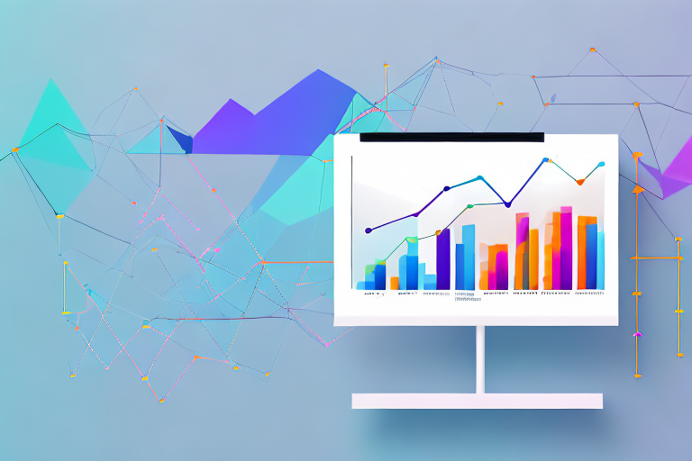
Visualizing data is a powerful way to communicate complex information to a wide audience. It allows us to present data in a way that is both attractive and informative, making it easier for people to understand and analyze. Whether you are trying to communicate financial data to investors or scientific data to researchers, data visualization can help you convey your message in a clear and concise manner.
The Importance of Data Visualization
The importance of data visualization lies in its ability to transform raw data into a strategic asset, unlocking its full potential for insight and decision-making. By presenting data in a visually appealing and accessible manner, we can disseminate complex information in a way that is easily digestible for everyone, including those without technical knowledge.
Data visualization can also help us identify trends and patterns that might otherwise be difficult to spot. By presenting data in a visual format, we can quickly identify correlations and relationships that might not be immediately apparent from looking at raw data. This can be especially helpful in fields such as healthcare and finance, where identifying trends and patterns can have significant implications for decision-making.
Key Principles of Effective Data Visualization
There are some key principles that are important to keep in mind when creating effective data visualizations. These include:
Simplicity: Avoid cluttering your visualization with excess information that can distract or confuse the viewer. Focus on simplicity and clarity to ensure your message is easily conveyed.
Relevance: Ensure that your visualization is relevant to the message you want to communicate, avoiding extraneous or unnecessary information.
Aesthetics: Emphasize the visual appeal of your visualization by leveraging carefully chosen colors, fonts, and graphics. This can help attract and hold the viewer’s attention.
Accuracy: Ensure that your visualization accurately reflects the underlying data, with clear labels and a suitable scale to avoid misleading conclusions.
Another important principle of effective data visualization is interactivity. Interactive visualizations allow viewers to explore data on their own, providing a more engaging and immersive experience. By allowing viewers to interact with data, we can encourage them to explore and discover patterns and relationships on their own, leading to a deeper understanding and appreciation of the data.
In conclusion, data visualization is an important tool for communicating complex information in a way that is both informative and visually appealing. By following the key principles of effective data visualization, we can create visualizations that are both accurate and engaging, unlocking the full potential of our data for insight and decision-making.
There is a plethora of options when it comes to front end data visualization libraries, each with their own unique features and benefits. Let’s take a closer look at some of the most popular ones available.
D3.js: The Flexible and Powerful Choice
D3.js is a popular JavaScript library that offers a highly flexible and customizable approach to data visualization, allowing you to create a wide variety of graphical representations to suit your needs. It provides a robust set of features for data management, manipulation, and visualization that make it a powerful choice for complex projects.
One of the key strengths of D3.js is its ability to work with a variety of data formats, including CSV, JSON, and XML. This makes it a versatile choice for projects that involve multiple data sources. Additionally, D3.js provides a wide range of visualization options, including bar charts, line charts, scatterplots, and more. You can also create custom visualizations using SVG and CSS, giving you complete control over the look and feel of your charts.
Chart.js: Simple and Responsive Charts
If you’re looking for a simple and intuitive library for creating responsive charts, Chart.js is a great option. With a focus on simplicity and ease of use, it is a popular choice for creating bar charts, line charts, and pie charts.
Chart.js provides a range of customization options, including the ability to change colors, fonts, and labels. It also offers built-in animations and tooltips, making it easy to create engaging and interactive charts. Chart.js is compatible with a variety of browsers and devices, ensuring that your charts will look great on any platform.
Highcharts: Interactive and Customizable Visualizations
Highcharts provides a range of interactive and customizable chart options and is known for its diverse compatibility with multiple browsers and platforms. It offers an extensive set of built-in features like tooltips and animation effects for improving the user experience of your visualizations.
One of the key strengths of Highcharts is its ability to handle large datasets with ease. It also provides a variety of chart types, including column, line, area, and pie charts, as well as more complex visualizations like heat maps and treemaps. Highcharts also offers a range of customization options, allowing you to tweak everything from colors and fonts to data labels and tooltips.
Google Charts: Easy Integration with Google Services
If you’re looking to integrate data visualizations with Google services, then Google Charts is the ideal choice. It provides a wide array of customizable visualizations for Google Sheets, Google Docs, and other Google-based applications.
Google Charts offers a range of chart types, including bar charts, line charts, and scatterplots. It also provides a variety of customization options, including colors, fonts, and labels. One of the key strengths of Google Charts is its ability to integrate seamlessly with other Google services, allowing you to easily embed charts and visualizations in your Google Docs or Sheets.
Leaflet: Mapping and Geospatial Data Visualization
If you need to create maps or spatial data visualizations, Leaflet is an excellent open-source library. It offers a range of features for creating maps with markers, popup boxes, and interactive layers, making it a popular choice for displaying geographical data.
Leaflet provides a variety of customization options, including the ability to change map styles, add custom markers, and overlay data on top of maps. It also supports a variety of data formats, including GeoJSON and KML. Leaflet is compatible with a variety of browsers and devices, making it a versatile choice for projects that involve geographic data.
Data visualization is a powerful tool for communicating complex information in a clear and concise manner. However, creating impactful displays requires more than just throwing data onto a chart. Here are some techniques to help you create effective visualizations:
Choosing the Right Chart Type
Choosing the right type of chart can be essential to impactful data visualization. Depending on the type of data being presented, certain chart types may be more suitable than others. For example, a pie chart may be ideal for displaying proportions or percentages, while a line chart may better communicate trends over time. Bar charts are great for comparing different categories, and scatter plots can show the relationship between two variables.
It’s important to consider the audience and the purpose of the visualization when choosing a chart type. A chart that works well for one audience may not be as effective for another. Additionally, it’s important to keep in mind that not all chart types are created equal. Some chart types, such as pie charts, can be misleading if not used appropriately. Always make sure to choose a chart type that accurately represents the data.
Enhancing Readability with Colors and Typography
The use of color and typography can have a significant impact on the readability of your visualizations. Use appropriate contrasts between colors to ensure that information is easily understood, and consider using typographic features such as bold text or italics to emphasize key points.
When choosing colors, consider the emotions they evoke and the cultural associations they may have. For example, red is often associated with danger or urgency, while blue is often associated with trust and stability. It’s also important to consider color blindness and ensure that your visualization is still readable for those with color vision deficiencies.
Utilizing Interactive Elements for User Engagement
Interactive elements such as hover-over data points, zooming, and filtering can significantly enhance user engagement with your visualization. These features allow users to explore data in more detail and gain greater insights.
Interactive elements can also help to highlight key points or trends in your data. For example, you could use a slider to show how a trend has changed over time, or allow users to click on a specific data point to see more information about it.
Telling a Story with Your Data
Effective data visualization is not just about displaying data in a clear and concise manner, but also about telling a story. By framing your visualization with a narrative, you can help users understand the importance of the data being presented, and provide context to the data.
Consider the story you want to tell with your data. What is the main message you want to convey? What are the key takeaways? By answering these questions, you can create a visualization that not only presents data, but also tells a compelling story.
Remember, the goal of data visualization is to make complex information more accessible and understandable. By utilizing these techniques, you can create impactful displays that effectively communicate your message to your audience.
Data visualization is an essential tool for making sense of complex data. However, creating effective visualizations requires more than just technical know-how. In this article, we will explore some best practices for front-end data visualization that can help you create visualizations that are accessible, inclusive, and optimized for performance.
Ensuring Accessibility and Inclusivity
Accessibility and inclusivity are critical considerations when creating data visualizations. To ensure that your visualizations are accessible to all users, you should consider the following:
Colorblindness: Use color palettes that are accessible to users with color blindness. You can use tools like ColorBrewer to generate color schemes that are accessible to users with different types of color blindness.
Alternative text: Use alternative text for all images in your visualizations. This is particularly important for users who rely on screen readers to access content.
Easy-to-understand data: Present data in a way that is easy to understand for users with different levels of technical ability or cognitive capacity. This may involve simplifying complex data or providing additional context to help users understand the information being presented.
Optimizing Performance for Large Datasets
For large datasets, it is essential to optimize performance to ensure that your visualizations remain responsive and user-friendly. Here are some techniques that can help you optimize performance:
Caching data: Caching data can significantly improve the performance of your application by reducing the number of database queries required to generate a visualization.
Server-side rendered visualizations: Server-side rendered visualizations can be faster than client-side rendered visualizations, particularly for large datasets. This is because the server can generate the visualization and send it to the client as an image, rather than requiring the client to generate the visualization itself.
Adapting Visualizations for Different Devices and Screen Sizes
With the growing use of mobile devices and screens of different sizes, it is essential to design data visualizations that are responsive and adapt to different devices. Here are some techniques that can help you create responsive visualizations:
Scaling elements: Use CSS to scale elements in your visualization based on the size of the screen. This can help ensure that your visualization is readable on screens of different sizes.
Altering layouts: Alter the layout of your visualization based on the size of the screen. For example, you may want to display a different layout on a mobile device than on a desktop computer.
By following these best practices, you can create data visualizations that are accessible, inclusive, and optimized for performance on a variety of devices and screen sizes.
Front end data visualization has become an increasingly important aspect of modern data analysis, enabling us to communicate complex information in a visually appealing and accessible manner. Whether you’re a data scientist looking to explore data in greater depth, or a business professional looking to communicate insights to stakeholders, there are a variety of tools available to help you create effective visualizations. By keeping in mind the key principles and techniques discussed in this article, you can create impactful displays that convey a story and inform decision-making.